Postmortem
Goals
As a long time Source game mod maker, I was interested in learning a modern publicly available engine to make VR games with. Unreal Engine 4 felt like a natural option due to its relative likeness to Source and complete toolset out of the box. Having a lot of free time on my hands, the 2018 Awful Summer Jam proved the push I needed to start developing.
I didn't have many easily realizable game ideas, and nothing that meshed well with the jam theme of "Unnecessary Sequels". Since the set of main game mechanics seemed relatively small and easy to implement, I decided on making a simple top-down scrolling shoot 'em up. My main inspirations for the game mechanics came from the Touhou series and Raptor: Call of the Shadows.
Development
For the initial design, I chose to go with a bullet hell style game, where the player primarily has to dodge incoming projectiles. As a slight deviation from standard bullet hell games, instead of going down in one hit, the player has a limited health pool instead of extra lives, and only having to restart the level on death.
Planned was also a shop giving the option to purchase new upgrades and weapons between missions.
As the base game design didn't incorporate the jam theme, I had to figure out a way to include it. During development I came up with a few ideas.
Theme ideas
Narrative idea: Player saved the world in previous game, rewarded with unimaginable wealth. The game starts with a tutorial level where they have to shoot an enemy. This action earns them enough money to overflow the money counter to $0, forcing them to take up working as a mercenary.
Pros:
- Possibly funny
- Provides some motivation for the gameplay
Cons:
- Doesn't affect gameplay
- I'm bad at narrative
Gameplay idea: Button that lets you replay levels after completing them, only to be met with the wreckage of the enemies you shot down. It could also have cleanup crews and emergency vehicles spawning, which the player can shoot down for a financial penalty.
Pros:
- Very unnecessary
Cons:
- Doesn't add much to the gameplay, or seem fun to play
- Requires more assets to be created
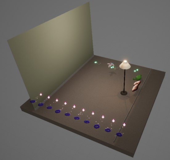
Gameplay idea: Play through the room of the classic YouTube clip "The Girl Next Door". Meet and battle the famous plush frog. This was the chosen idea.
Pros:
- Everyone loves frogs, right?
- Has actual gameplay
- I already had some old art assets laying around
Cons:
- Pretty weak on the theme
- The clip was removed from YouTube
- Doesn't fit the general aesthetic
Scope
As I had no idea how long my ideas would take to implement, making a shoot-'em-up seemed like a good choice. The core game mechanics of moving and shooting seemed relatively quick to implement, with the possibility of down-scoping any extras if time ran out. My assessment turned out to work, I had to cut down several features, including enemies, bosses, weapons and the store mechanic, but all the core mechanics made it in.
Game design
The game is written entirely using the UE4 Blueprint visual scripting system and the UMG UI editor. A main level is set up with a static camera with a narrow field of view placed far above the play area in order to give a small amount of parallax without major perspective differences in different parts of the screen. Since I couldn't find any way to move the screen position of the game render, I offset the camera instead to get the play area to the left side of the screen. This resulted in a small amount of perspective skew.
The individual levels contain the geometry and enemy spawning logic, and are loaded into the base using level streaming. The level geometry consists of lighting and a background with scrolling textures, with the player remaining in a static area. Enemy spawning is static and based on time, with the spawning information read from a data table.
I spent a lot of time trying to get the user interface and menus to work well. The UMG system turned out to be badly suited for keyboard driven menus, with key remapping and focus ordering seemingly being impossible to do through the designer. I also attempted to make the game resolution and aspect ratio seamlessly scalable by resizing the window. Even with the lack of accessible options for this in UE4, this worked fairly well, apart from having no constraints on minimum resolution or aspect ratio.

Player mechanics
The game mostly uses standard bullet hell mechanics. Normally in bullet hell games, the player dies to one hit. This game uses the same concept, but presented slightly differently. When the player dies, the ship takes damage instead of getting destroyed. I think I failed to properly communicate the severity of the event to players, making them take too large risks. The level also restarts when the player is destroyed, which might be a too severe punishment, although that would have been necessary to balance the planned shop mechanic.
In order to make dodging bullets and enemies easier, the main hitbox of the ship only occupies a small portion of the model. A second hitbox covering the entire model handles collisions with static obstacles, as well as third rectangular hitbox enabling wing ramming enemies.
In hindsight, the player model does not telegraph the location of the main hitbox very well. Ideally the craft should be built around it, or at least have some kind of focus point added to it.

Red - main hitbox, blue - wing hitbox, green - world hitbox
More standard bullet hell controls are the focus mode and bomb. The focus mode slows down the player movement when the key is held, as well as showing a representation of the player hitbox. The bomb, or shield overload in this case, clears bullets around the player and gives them temporary invulnerability, as well as damaging or destroying nearby enemies. The player can store a maximum of three bomb charges, starting with one. The bomb bar charges up over time, faster if the player doesn't fire their weapons in order to give an incentive not to keep the fire button held down.
Cut features
A planned feature was a shop where the player could buy weapons in between levels, using cash earned by killing enemies. The player could then switch between weapons with a button press. Alternative weapons planned were homing missiles and a charge-up laser.
Another planned feature as copying the Touhou Project grazing mechanic, where passing close to bullets so they only hit the outer hitbox would reward the player in some way. Either by small amounts of cash, or recharging your shield faster.
Enemies
The standard drone enemy was an attempt to make a more sci-fi version of existing ducted fan drones. The drones move in predictable lines and fire either slow moving projectiles or lasers at the player.
The laser using drones were planned to have a different model, a central body with a tiltable jet/rocket engine on either side. An asteroid mining drone was also planned for the second level.
Concrete pillars and floor lamps that collide with the player’s secondary hitbox. If the player gets trapped between one and the bottom of the screen they take unblockable damage.
The frogs act like ground emplacements, the player can pass them without colliding but bullets still damage them.
Also planned were enemies without attacks: Cargo vehicles and asteroids. The player would have to dodge or destroy them.
For enemy spawning and formations, I attempted to gradually introduce different mechanics in the first two levels. Starting the first level with only down moving bullets, making it more difficult with denser formations, and then introducing sideways bullets and bullets aimed at the player. Then in the second level I introduce lasers, first as a mean of periodically sectioning off parts of the screen, and then directly aimed at the player to force them to dodge. These features seem to take a lot of polishing and playtesting to make sure they work well.
Bosses
The first map had a custom boss planned, a giant cargo vehicle armed with gun emplacements, that would try to run away from the player. Instead all the level use scaled up drone enemies with increasingly larger health pools and more difficult attack patterns.
The last level uses a giant static frog boss with multiple stages. The stages activate by time, and give the frog more attacks.
Each level has a mini boss, a weaker boss enemy, sometimes spawning together with a group of other enemies. Unlike stage enemies, spawning the mini boss stops the level spawn timer, preventing the level from progressing until it is destroyed.
Levels
The game comes with three levels. Originally a night-time cyberpunk-esque level was also planned, but that would have required a large amount of assets and setup.
The first level was imagined to be a futuristic cargo port, with the player coming in over the ocean dodging cargo spaceships and culminating with a boss battle upon reaching the dockside.
The second level was supposed to be an asteroid belt, with the player dodging asteroids and shooting up mining drones.
The third level is the jam theme tie in. You fight through corridors adorned with frogs and lamps, ending up fighting the Frog. Unlike the other levels, the side walls are solid objects that bullets and enemies can collide with.
Assets
Art style
Previously used to creating photorealistic assets, I wanted to try something else instead. My goal was using flat shaded low-poly models with pixel art textures and a sci-fi cyber punk style aesthetic.
The background cockpit panels were also meant to be 3D modeled, but I could not find a way of rendering them without spawning them into the world. Instead I made a pixel art background, designed to look like cockpit panels. I planned on making the UI data more diegetic, with the health being displayed as a damage status display on the right screen, as well as lighting up the warning lights whenever the player was damaged.
Player model
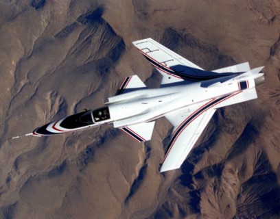
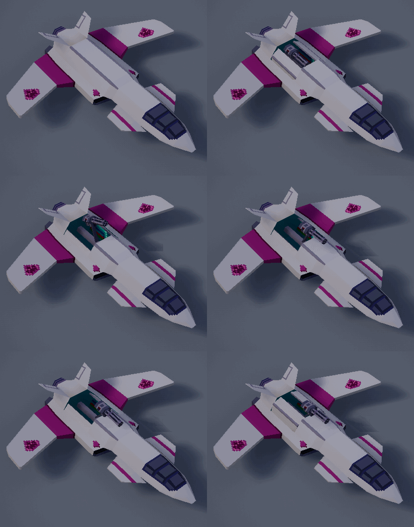
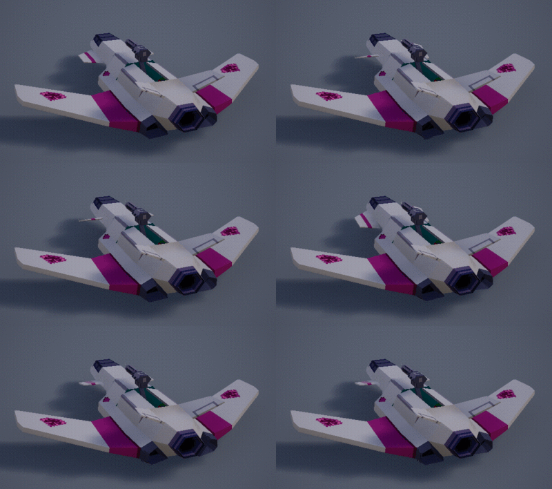
The player ship is heavily inspired by the Grumman X-29 experimental fighter. To make it fit the chosen style better it was made more angular and flattened up, and a rocket engine added. To facilitate multiple weapons a rotary weapon bay was added, originally to the bottom of the ship. Since it wouldn’t be visible in a top down game, the bay was moved to the top instead. 
Image courtesy: NASA

In order to make the ship more visually interesting, I added movement based animations to the canards and engine nozzles. While this tuned out to not be very visible directly, attaching the engine flame particles to the thrust vectored nozzles enabled them to be angled along with the nozzles. Figuring out the UE4 animation system proved tricky, taking up an entire day to get the dynamic animations to play along the keyframed ones.

My initial texturing workflow consisted of doing everything in Blender. Unfortunately the Blender texturing tools are very ill suited for pixel art, slowing down the process considerably. Another mistake I made was to cut up the UVs of all hard edges into individual islands. This made texturing extremely difficult in any 2D tool. I did not realize this until very late in development. I also didn't realize the importance of keeping quads planar in the mesh, as any non-planar quads stand out when using flat shaded polygons. Designing models around triangles rather than rectangles might make things easier.
Sounds
All sound effects were made using the Bfxr online tool. I had no plan on how to add music, ideally I'd like to learn how to compose music, the tools seem simple enough, but actually doing it seems absolutely incomprehensible.
Conclusion
Most of the feedback involved the game being too difficult of the game and a lack of gameplay and feedback as well as general blandness. Regarding the difficulty, either adding different difficulty levels, or starting the game easier and ramping it up might work. The second level in particular feels relatively hard.
The blandness would probably been remediated by implementing more of the planned features, in particular more player weapons and enemy variations. I also failed to properly indicate the damage done to both enemies and the player, possibly making parts of the gameplay unsatisfactory.
This project proved a bit too complicated for a three week jam, at least for a one person team with no experience with the art style or genre. For a future jam I'd probably need to either do a simpler game, or one more familiar too, or join a team.
Get UltraFighter RX5000 / The Girl Next Door II
UltraFighter RX5000 / The Girl Next Door II
Pew pew
| Status | Released |
| Author | Rectus |
| Genre | Shooter |
| Tags | Bullet Hell, Low-poly, Pixel Art, Shoot 'Em Up, Top down shooter |
More posts
- Version 1.2Jul 30, 2018
Leave a comment
Log in with itch.io to leave a comment.